Webdesigntuts+ |
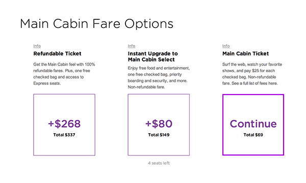
| How They Did It: Virgin America’s New Storefront Posted: 28 May 2014 01:38 AM PDT Virgin America has launched a new booking service, and it's a lot of fun! The concept of a flight booking experience being fun sounds nearly impossible. For years, booking a flight online has been a relatively cold undertaking and pointed purely at business objectives. Virgin has created a different experience. Today, we're going to talk about how they've changed the average booking experience and made it more approachable and delightful. Hello World, the Meta SiteOne of the first things you might notice is that Virgin introduces their new site with a Hello World site, furnished with some brilliant SVG animation. This is intended to be a basic overview of the new booking experience, explaining its most prominent features and goals. 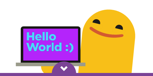 This meta-site was created using jQuery One Page Scroll by Pete R., a plugin inspired by Apple's iPhone 5S product feature site. Featuring Swiffy-created animations, a Vine video, as well as a few CSS/JS powered animations, the introduction even points out the new whimsical design elements as a feature of the relaunch. 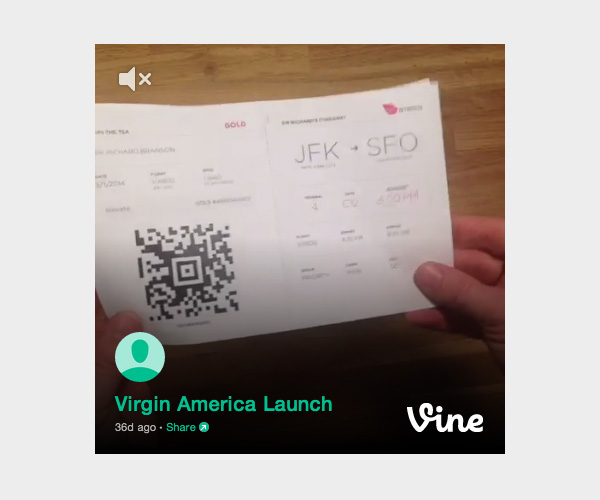 This is a particularly interesting marketing move, as it truly sets the stage for the new booking experience. Beyond simply explaining the functions of the new site, the meta-site gives credibility to the new reveal and builds the positive tension of trying the new experience. There's a lot to unpack in this site, so for the sake of completeness, we will be skipping some of the technical details that belong in more specific tutorials. Instead, we will talk about some of the primary aspects of the design strategy, and summarize some of the overarching technical implementation strategy. Booking UX: Full Screen Form DesignThe booking experience can most accurately be described as a very highly designed form experience. The form steps you through the following process:
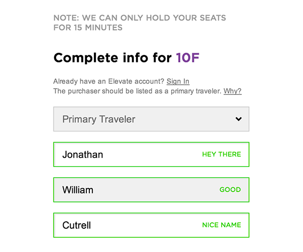
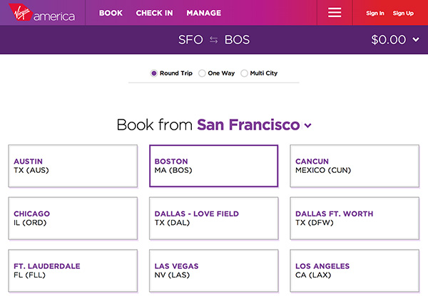 Instead of doing this via a traditional form, Virgin has chosen to make this a modal experience that focuses on singular decisions. But instead of just using traditional input methods, Virgin relies primarily on clicking instead of typing. This allows the user to focus on visual decisions rather than logical decisions. The primary control is a clickable box outline with text in the center, which is repeated throughout the booking process. Secondary controls include simple 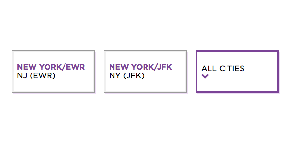 The full screen form utilizes Angular to handle the application data binding, and does not appear to utilize any particular UI framework. The CSS file is 16,800+ lines unminified. "Unlocking" SectionsOne of the decisions made by Virgin is to unlock different sections of the form once they are filled out, and leave them accessible throughout the rest of the booking process. Once you have completed one part of the form, the next part shows and the page automatically scrolls to that section's position. Delightful LanguageVirgin is known for their light-hearted branding strategies and daring copywriting, and the new booking experience is no exception. For instance, when you choose Portland as your destination, the app reminds you to "pack your plaid," and asks if you are headed to "Hahvahd" (Harvard) if you choose Boston as your destination. This kind of rich language goes in direct opposition to the traditional booking experience. 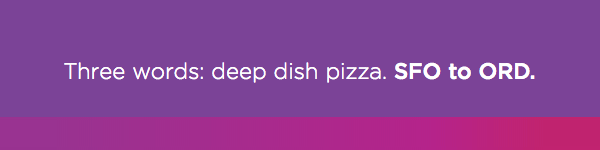
|

| You are subscribed to email updates from Tuts+ Web Design To stop receiving these emails, you may unsubscribe now. | Email delivery powered by Google |
| Google Inc., 20 West Kinzie, Chicago IL USA 60610 | |
No comments:
Post a Comment